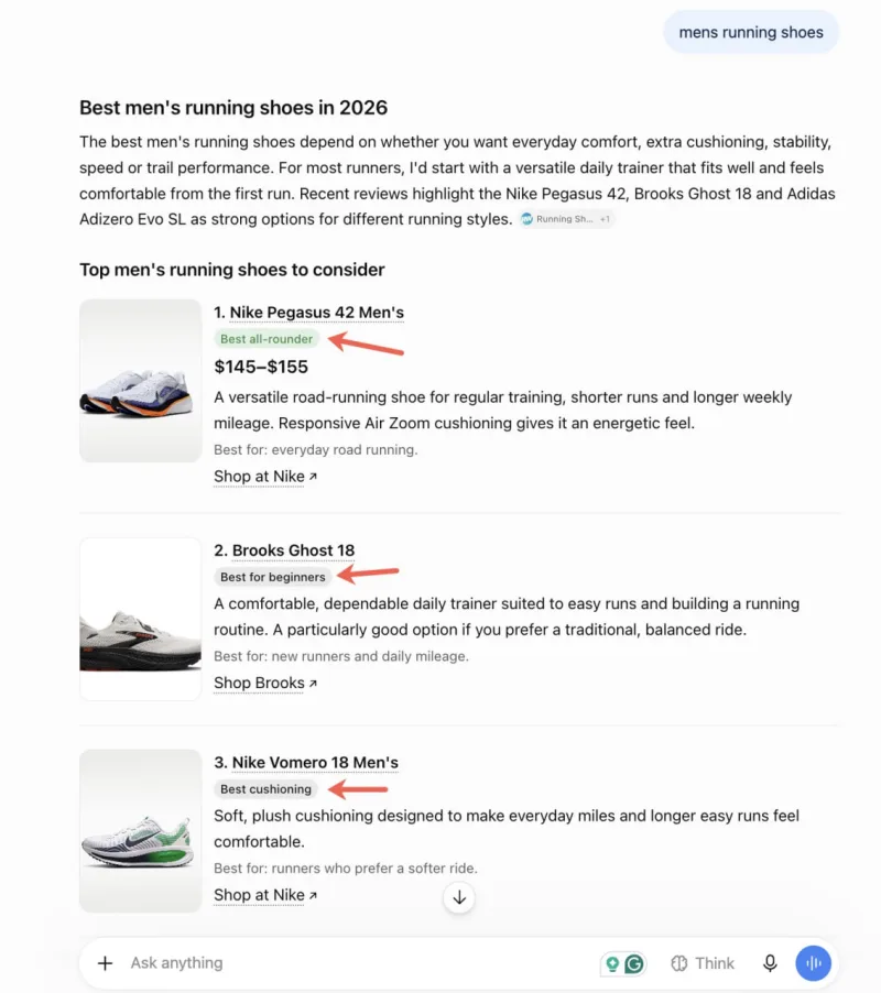
ChatGPT has started showing coloured labels next to some organic product listings. A green badge marks the option the system calls 'best overall'. Other products receive grey labels with phrases like 'best for beginners' or 'best cushioning'.
For SEO specialists and site owners, the change is more visible: coloured tags pull cards out of the text flow and may shift which listing a user picks.
What was spotted
SEO specialist Brodie Clark caught the experiment through a search monitoring service and posted a screenshot on X. The observation was reported by Search Engine Roundtable in 2026.
The displayed results show several types of product recommendations. Green highlights the item with the broadest claim: 'best overall'. Grey separates listings by narrower use cases. Examples include a product for beginners and a model with the best cushioning.
The main visual shift is the badge itself. It stands out from the even text stream where product descriptions usually run together. A user spots a coloured marker faster, so the chance of a click may rise purely from the visual accent.
Why colour matters
A text response from ChatGPT is harder to scan than a standard search grid. There are no classic rows with separate columns for title, price, rating and link. Recommendations read as part of the overall answer.
A coloured badge changes the hierarchy. A card with a green tag looks more important than the grey ones beside it. If the label fits the query, it can catch attention before the user finishes reading the other options.
That is reason to check how labelled recommendations perform across different topics. It helps to compare listings with a neutral description against those the interface assigns a specific tag. The difference between 'good option' and 'best for beginners' is more than phrasing. It tells the user what the product is for.
How labels guide choice
Phrases like 'best for beginners' or 'best cushioning' attach a short use case to the card. The user does not need to work out who the product suits or which features matter.
These captions stand out most in long lists. When there are many listings, a broad assessment quickly blends with neighbouring recommendations. A grey label isolates a narrow advantage and gives an extra reason to consider that card.
The green marker uses a wider criterion. 'Best overall' sounds like the result of comparing several tasks, though the experiment does not show what those criteria are. Treat the tag as a signal from the interface, not proof of a separate product test.
Link to the earlier experiment
The new badges extend an earlier ChatGPT test. At that stage, captions were already in use but looked more restrained and came without prominent coloured blocks.
So it is not just the wording of the recommendation that is changing. Its visual weight is shifting. A text label stays part of the answer; a coloured badge becomes an interface element in its own right.
That strengthens the connection between ranking and CTR. A card may hold a strong position by content, but a visible marker can alter user behaviour. If someone relies on colour and a short characteristic, they click before comparing all the surrounding descriptions.
What SEO and affiliate specialists should do
Do not try to tune every product description to possible labels. Access to the internal recommendation logic has not been shown, and the test is at an early observation stage.
It is more useful to check the quality of product pages. Their headings, specifications and use cases should let the system understand where the universal option sits and where an advantage applies to a specific buyer group.
For affiliate marketing, that means separating two tasks. One product may sell well to a broad audience; another offer is better explained through a concrete query. In the ChatGPT example, those roles are reflected in the green and grey tags.
If an offer suits beginners, that advantage needs to show clearly. If it is chosen for economy or support, the description should also contain the matching feature. Otherwise even a strong card risks being lost next to neighbouring recommendations.
Why it is too early to draw conclusions
The observation shows individual coloured labels but does not reveal the rules for assigning them. The screenshot does not make clear whether colour affects position within the answer or only the styling of an already chosen card.
It is also unknown how tags will work across all product topics. But the interface itself gives a plain signal: in ChatGPT recommendations it is growing harder to compete on product description alone. A short benefit and a visual accent gain extra weight.
So a sensible step is to check your own pages in two directions. First: how clearly is it explained who needs the product and why. Second: can a user immediately pick out a strong card in a long answer.
Coloured labels show that ChatGPT continues to turn a list of recommendations into a visual feed. For the market, that may mean one more signal capable of affecting CTR and offer choice.


